The poster drop that has the IWC sweating
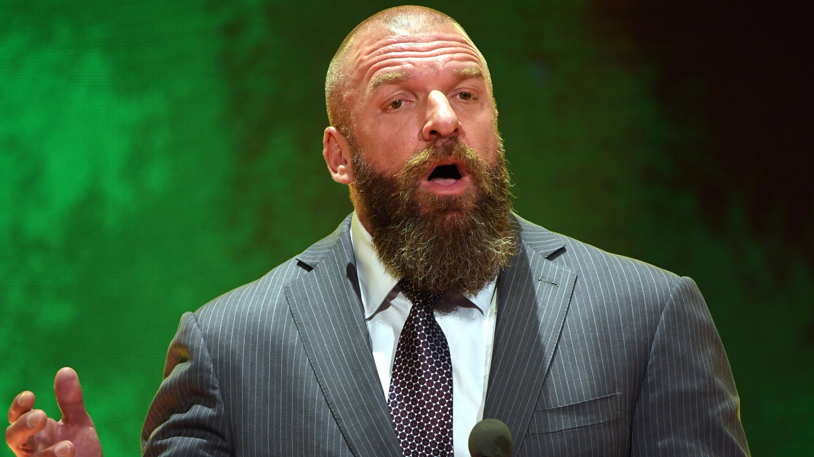
It is June 8, 2026, and Triple H just decided to interrupt our Saturday morning coffee with a visual flex. We finally have our first look at the Night of Champions event branding, and the graphic design team deserves a raise for not cluttering the screen with unnecessary noise.
You can see the full breakdown and the official start time details over at PWInsider. Honestly, after seeing the online debate regarding tonight's RAW main event pairing, a clean, high-stakes aesthetic is exactly what this product needs to refocus the conversation.
Why the timing is a massive bet
Let’s be real about the calendar here. We are exactly three days away from the FIFA World Cup kickoff. WWE is intentionally running a tight schedule to ensure they don't get buried under the avalanche of soccer coverage that is about to occupy every screen in America.
The booking strategy here is classic Triple H efficiency. He wants the diehards locked in before the casuals lose their minds over penalty kicks and offside traps. It is a bold move to lean into the wrestling machine right when the mainstream sports world is shifting focus.
The missed opportunity in the lineup
Now, I need to put on my grumpy fan hat for a second. While the poster looks elite, the lack of a clear definitive title unification featured prominently on the key art feels like a missed spot. If you are selling a card titled Night of Champions, give me the belts front and center.
We are currently seeing a strange tug-of-war for airspace, especially with figures like Danhausen making cameos at MSG. Wrestling is grabbing for any relevant cultural moment these days. The goal is to keep eyes on the screen despite the massive sports events looming on the horizon.
The cold, hard truth about these shows
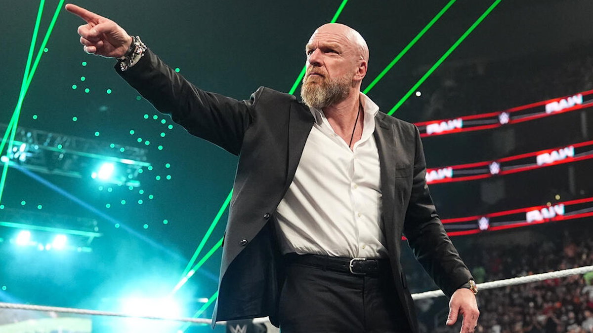
Look, the presentation is 10/10 right now. Triple H is playing chess while everyone else is playing checkers, but the actual match card is where the rubber meets the road. Catchy posters don't fix a sluggish second hour of television.
The current internal pressure to avoid the World Cup fatigue is massive. If WWE fails to deliver high-octane sequences during this window, the fans are going to flip the channel to find a striker from Argentina or a midfielder from England. They are walking a tightrope.
Final thoughts on the visual direction
The font choices and the lighting on the poster suggest a grittier, tournament-style vibe. I am here for it. If they can keep the matches under the 20-minute mark for the mid-card, they might actually pull this off without hemorrhaging viewers.
Let’s see if the creative team lives up to the hype on the poster. If the booking is as crisp as the graphics, we might actually look back at this June run as a pivotal moment for the year. Just keep the promos short and let the wrestlers do the talking in the ring.
Read Next
- WWE Night of Champions: Does the poster reveal tell us the full story?
- RAW's June 8 main event is already splitting the fanbase
- Chad Gable playing the field is the smartest move he has ever made
- R-Truth's career origins prove wrestling booking is stranger than fiction
- 🎍 WWE Night of Champions 2026 — Full Coverage Hub