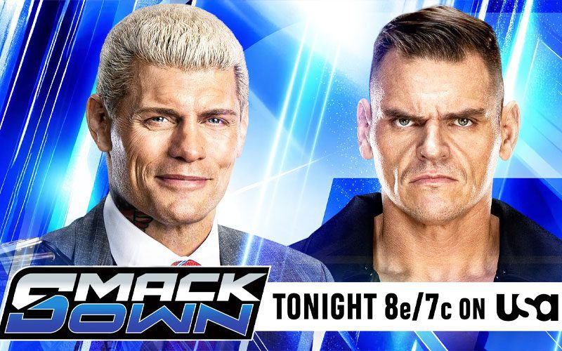
Why your favorite wrestling games feel like homework
Look, I get it. You fire up the console, you want to see a simulated 450 splash, and instead, you’re drowning in menus. Wrestling games have turned into glorified spreadsheet simulators. We are supposedly getting more realistic gameplay, but the friction of navigating these digital worlds is killing the buzz faster than a ten-minute rest hold in the mid-card.
The current state of digital gaming in this space has become a masterclass in over-engineering. We are seeing a shift where developers focus on color theory and UI grids rather than nailing the rhythm of a back-and-forth chain wrestling sequence. According to recent analysis from PWInsider, the way these interfaces are built is intended to trigger specific mechanical responses from players. It is calculated, it is scientific, and honestly, it is exhausting.
The design trap nobody asked for
Why do I need a degree in graphic design just to modify a move-set? You spend thirty minutes tweaking attributes and skin texture, then the actual match feels like you’re fighting the controller itself. The obsession with a clean UI has stripped the soul out of the experience. It feels like navigating a bank app instead of a high-octane brawl between larger-than-life characters.
The issue here is that the UI/UX design is actively fighting the momentum of the wrestling. If a player has to stop and interpret a color-coded prompt or a cluttered sidebar, they aren't engaging with the drama of the match. They are just clicking boxes. It is like being forced to read a manual while your opponent is setting up for a top-rope pile-driver. It breaks the immersion entirely.
The move toward sterile presentation
There is a dangerous trend of prioritizing clarity over chaos. Wrestling is beautiful because it’s messy. It’s sweaty bodies flying over barricades and heels cheating behind the referee's back. When you polish the UI to a mirror shine, you lose that grit. We’ve traded the wild, creative menus of the late 90s for a corporate, sanitized aesthetic that values efficiency over atmosphere.
Don't get me wrong, I like knowing which button does a neckbreaker, but I don't need a UI that screams for attention every five seconds. The best wrestling experiences let the action dictate the visual language. If the game needs a popup to tell me I’m having a good match, then the game isn't doing its job. We need to stop pretending that a flashy interface makes a mediocre combat loop better.
Ultimately, these design choices cater to people who enjoy the stats more than the storytelling. If you want to spend three weeks adjusting the lighting on a custom arena, sure, stick with the current trend. But for those of us who just want to hear the crowd pop after a 15-minute main event, the technology is getting in the way of the spectacle. Stop overthinking the buttons and start focusing on the carnage.